Project Brief
Tippy Toes underwent a packaging refresh to create a cleaner, more modern brand presence across baby food and developmental products. The redesign focused on simplifying the visual system while improving clarity for parents navigating age-based product offerings.
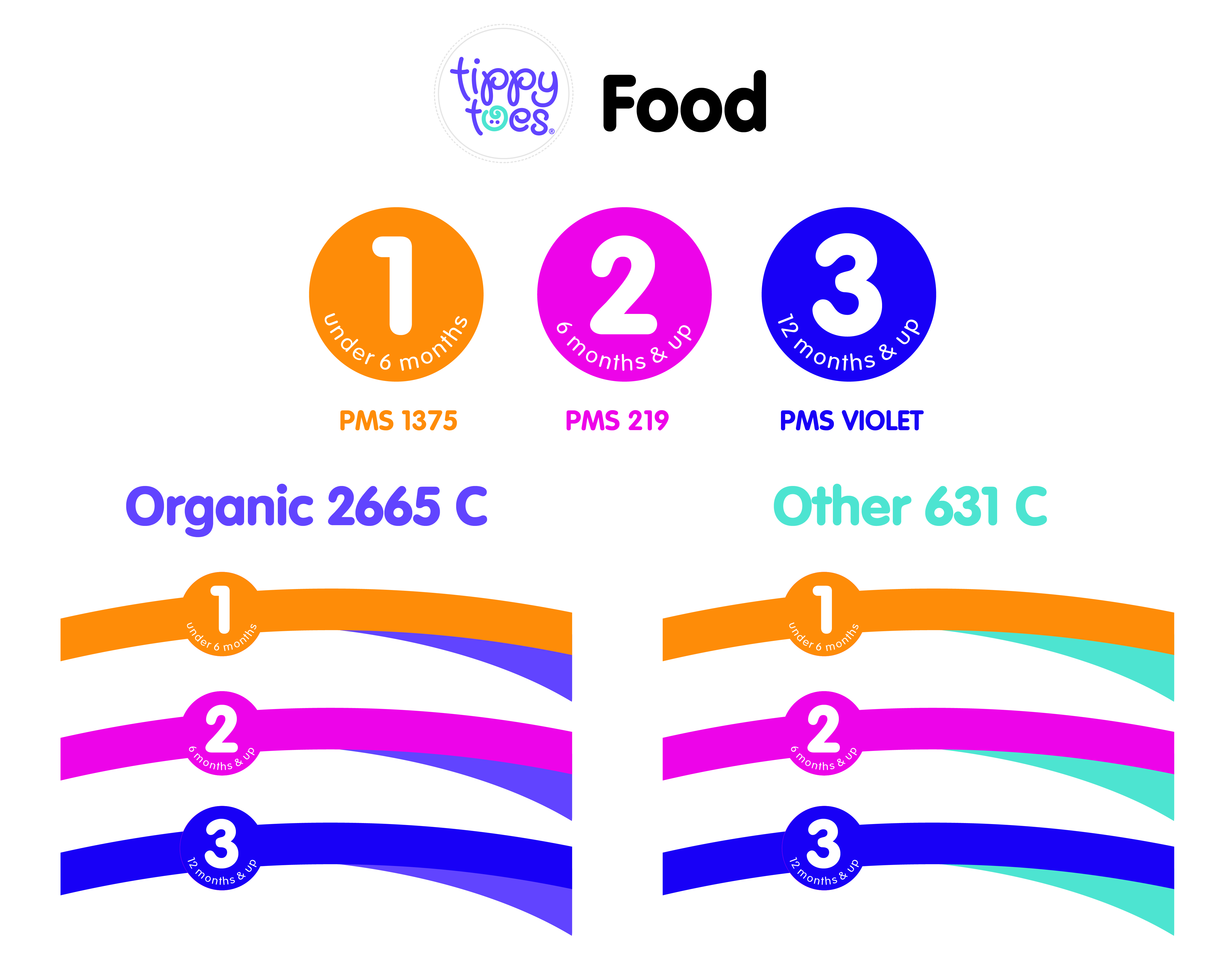
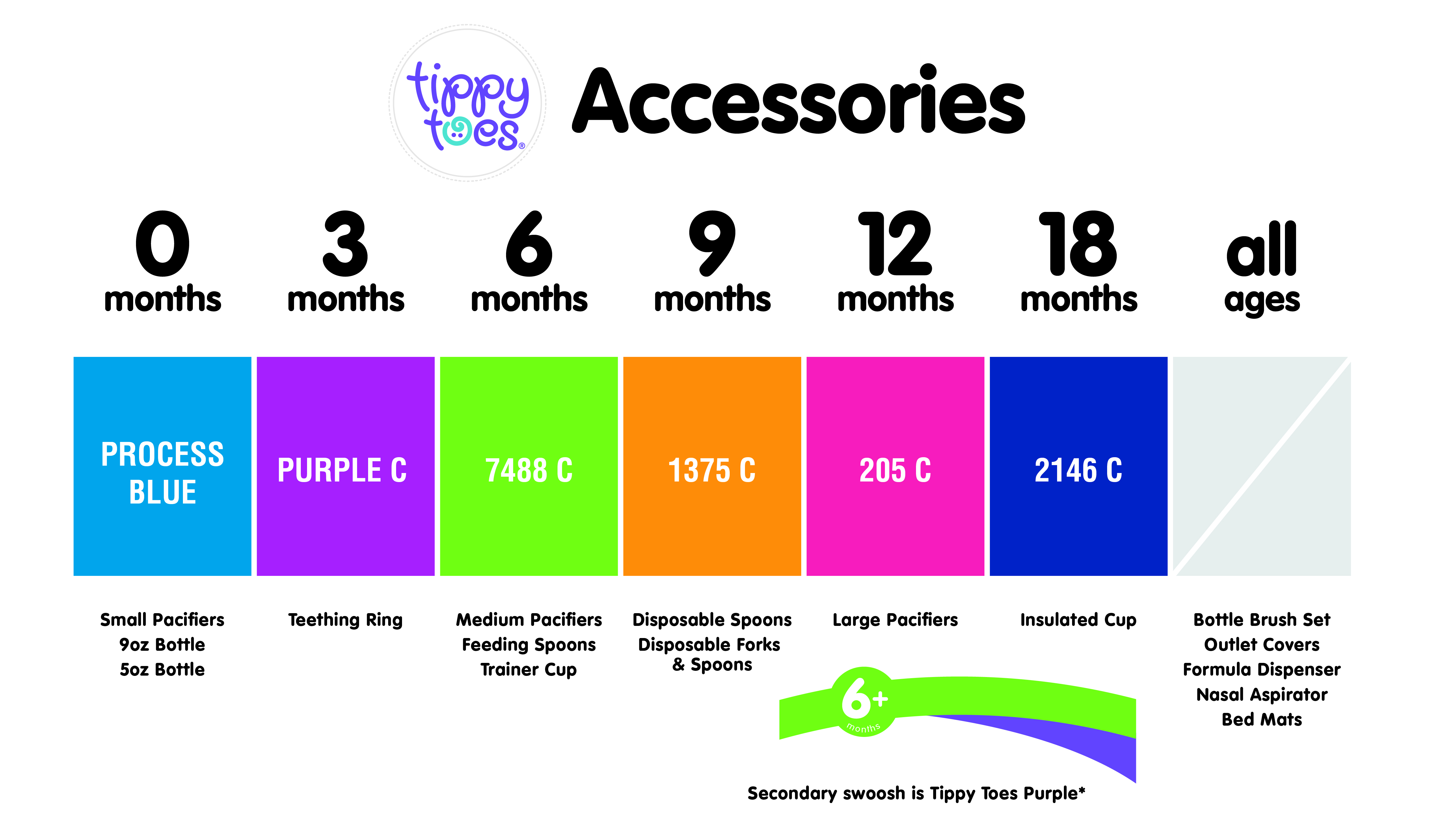
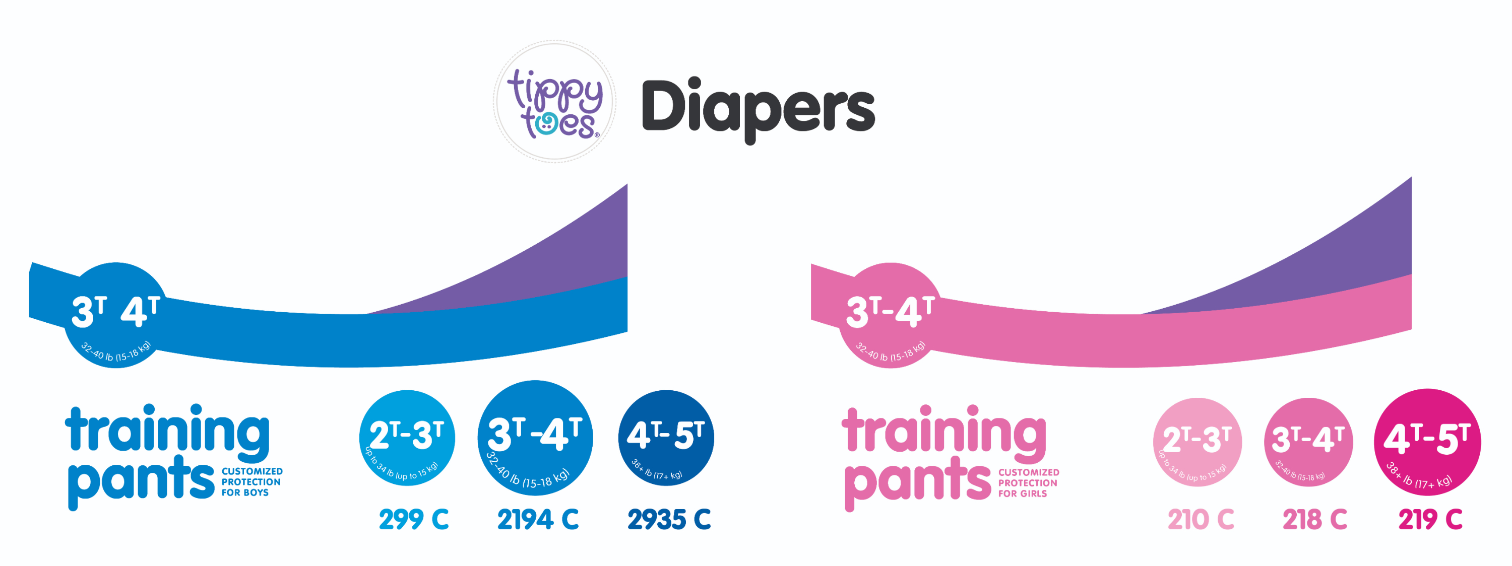
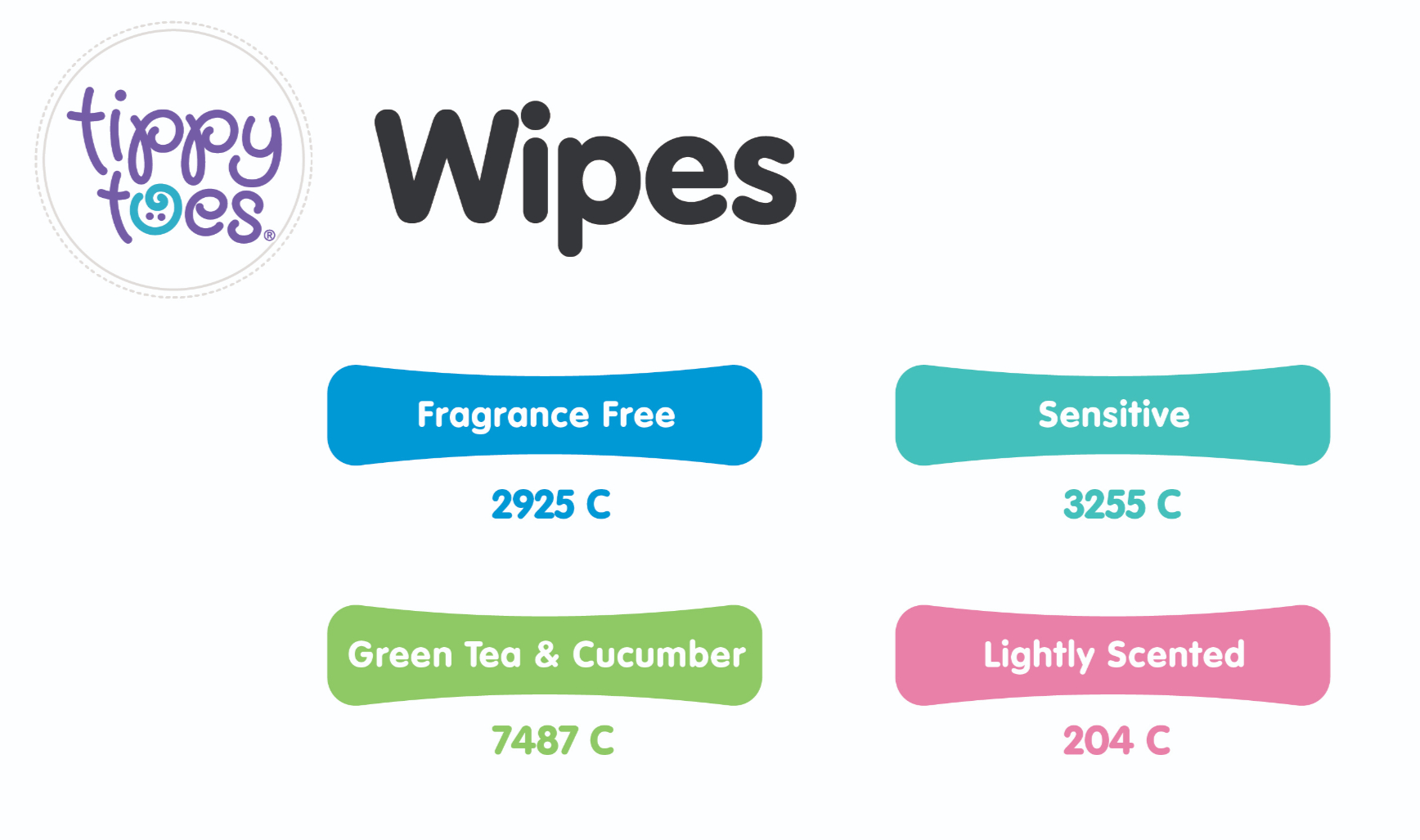
A key objective was to establish a clear color-coded system to differentiate ages, stages, and product types, supporting intuitive decision-making at shelf.
Tippy Toes Rebrand
Design Process
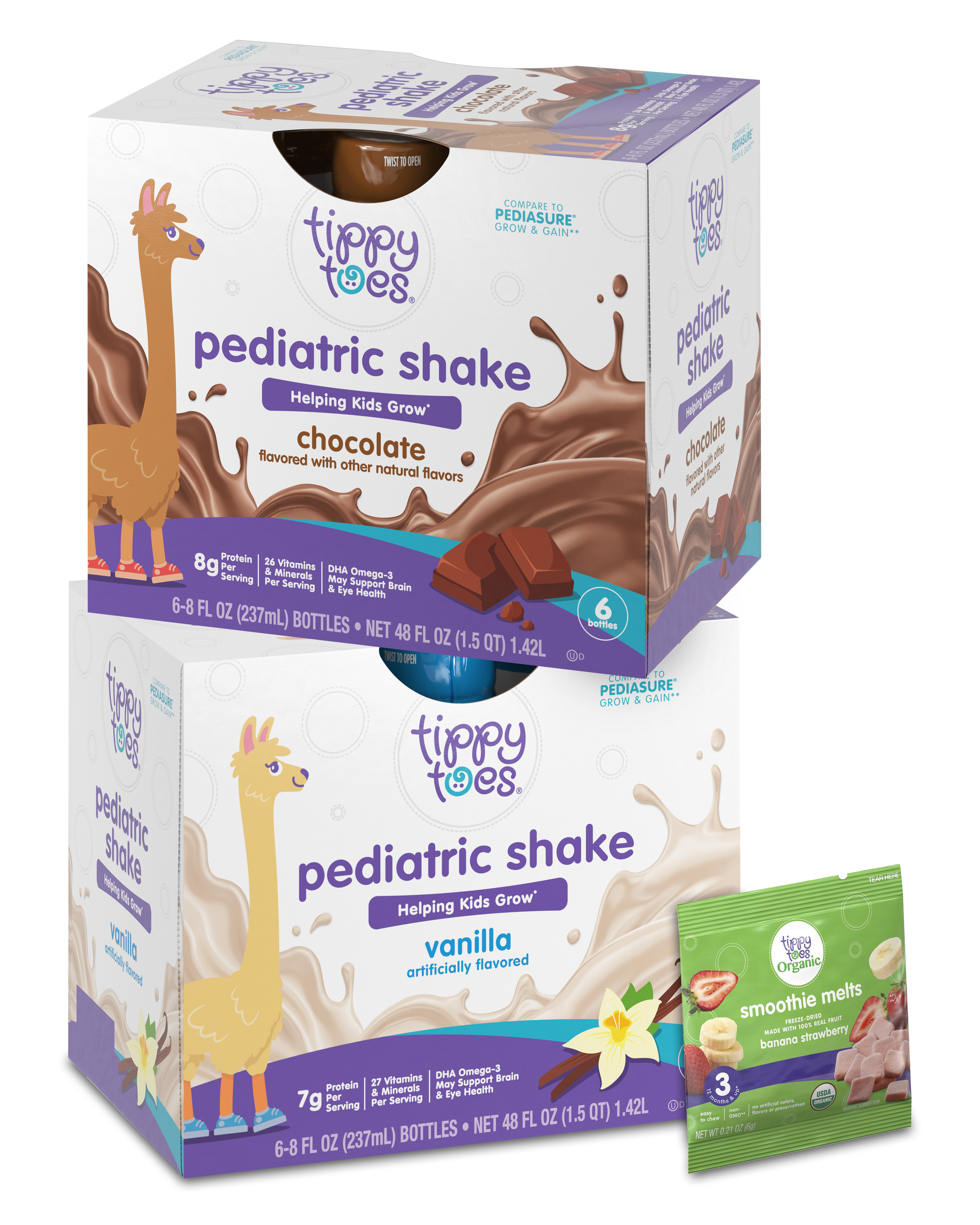
Developed and executed a streamlined packaging system that emphasizes clarity, consistency, and ease of navigation across product lines. Simplified layouts and refined typography to create a more minimal, clean aesthetic while maintaining essential product information.
Established a color-coded framework to distinguish age ranges and developmental stages, ensuring clear visual cues across SKUs. Integrated product indicators and iconography to support quick recognition and improve usability for parents shopping across multiple categories.
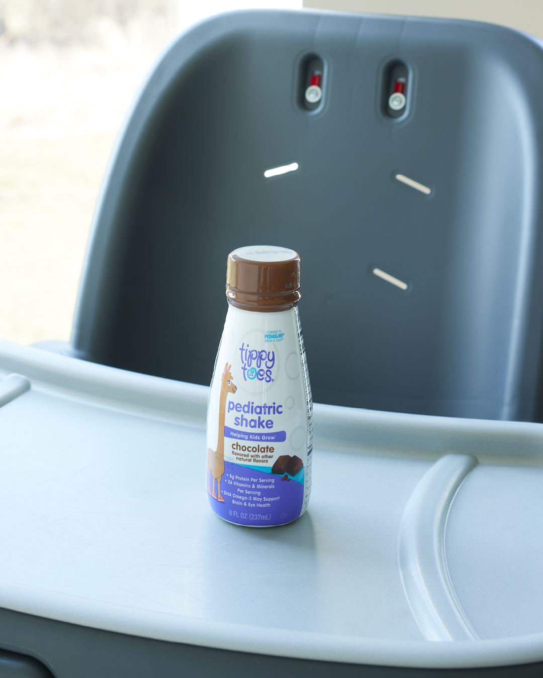
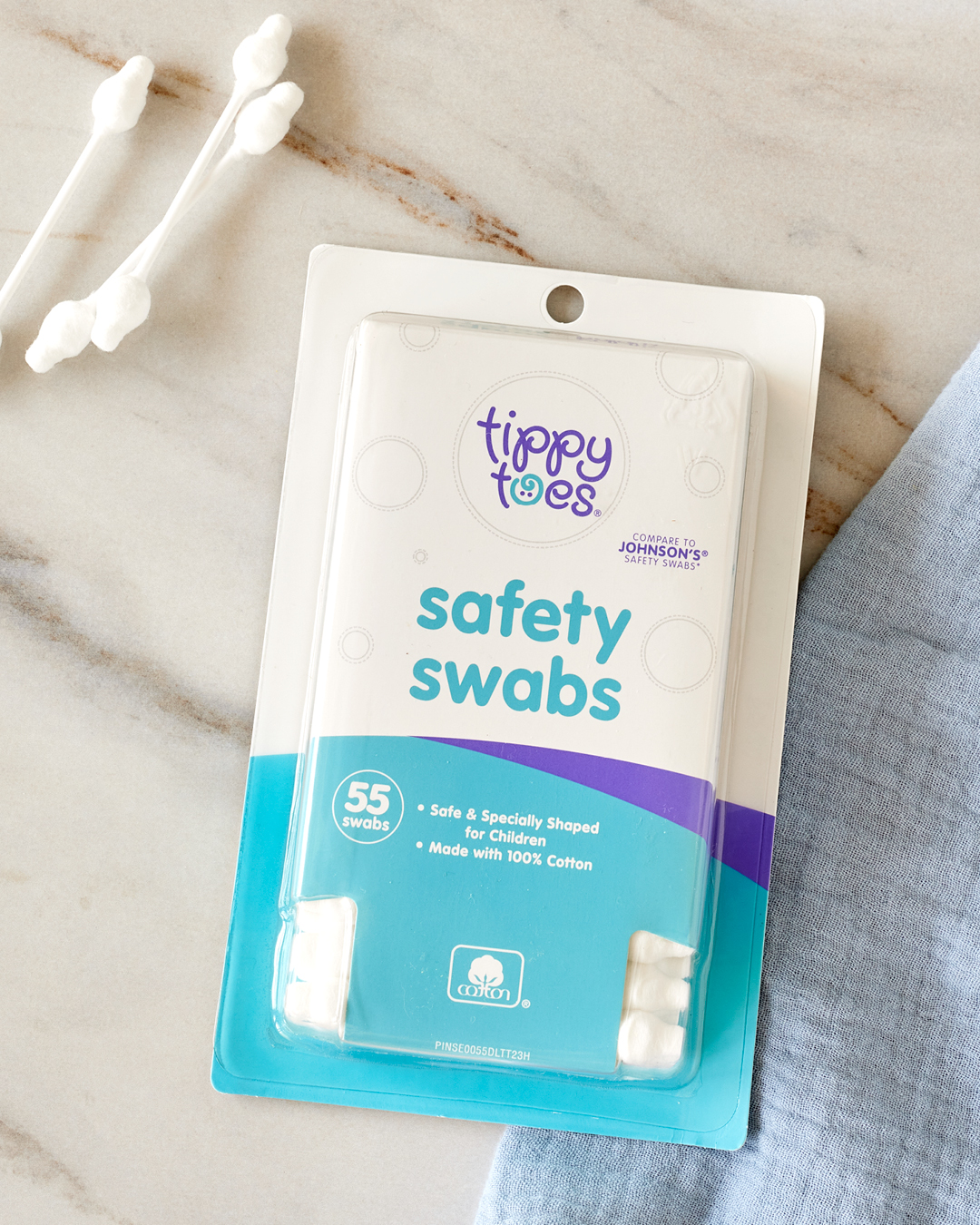
Applied the system across packaging formats to ensure cohesive brand expression and scalable rollout.
Final Deliverables
-
Packaging system redesign across baby food and developmental product lines
-
Color-coded framework for age and stage differentiation
-
Visual system for product indicators and iconography
-
Multi-SKU packaging rollout across categories
-
Refined layouts with simplified hierarchy and improved readability
-
Print-ready packaging files and production-ready artwork